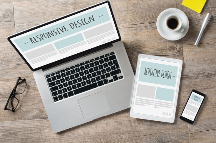
The Essence of Responsive and Adaptive Design
- Responsive Design offers greater flexibility by allowing the same website layout and content to fluidly adjust to different screen sizes. Through flexible grids, fluid images, and CSS media queries, responsive websites automatically adapt to the user’s device.
- Adaptive Design, on the other hand, provides the ability to customize experiences for specific device types. It uses predefined layouts designed for particular screen sizes such as smartphones, tablets, and desktops.
- Both approaches aim to improve usability, but they achieve it through different technical strategies.
- Understanding mobile vs desktop behavior is also important when deciding which design approach will work best for your users.
Development Time and Cost
- Responsive Design might have a higher initial development cost and time investment due to the need for detailed planning and testing across devices.
- Adaptive Design can be quicker and less costly if targeting a limited number of devices but may increase in complexity and cost with more devices.
Real-World Examples
- Responsive Example: The Boston Globe’s website is a classic example of responsive design, offering a consistent experience across devices.
- Adaptive Example: Amazon’s website uses adaptive design, providing different layouts for mobiles, tablets, and desktops, optimizing user experience on each device.
Statistical Insights
- Mobile devices now account for roughly half of global web traffic, making mobile-friendly design essential for modern websites.
- Google has also implemented mobile-first indexing, meaning websites that perform well on mobile devices are more likely to rank higher in search results.
- To ensure content performs effectively on smaller screens, businesses should also focus on writing for mobile UX, ensuring content remains readable, concise, and easy to scan.
Making the Right Choice for Your Website
Choosing between responsive and adaptive design depends on various factors, including your target audience, website objectives, and resource availability. Responsive design is generally recommended for its SEO benefits and flexibility, but adaptive design can offer tailored experiences for specific devices. You can also consider going with a hybrid approach. This means a mix of the two – you strategically apply adaptive or responsive where it best fits and makes sense. For example, a table with lots of data can be stripped of some information from the mobile views while displaying more data on a desktop view. At the same time, a two to three-column section with a minimal copy may suffice to go with a responsive design.
Engage and Decide
Now that you’ve grasped the differences between responsive and adaptive design, it’s time to evaluate your website’s needs. Consider your audience’s primary devices, your content complexity, and how you can best serve your users. Remember, the goal is to provide a seamless, engaging user experience regardless of the device.
Are you ready to take your website to the next level with the right design approach? Start today by reviewing your site’s analytics, understanding your users’ behaviors, and planning your design strategy. Whether responsive or adaptive, the right choice will empower your website to perform its best, reaching and engaging more users than ever before. Schedule a call today to get started.
